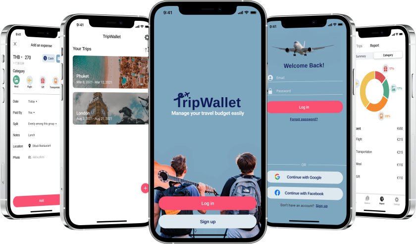
Tripwallet: A Travel Budget App
Overview
TripWallet is an app to manage your budget and expenses easily while traveling the world. Available as both iOS and Android native app, TripWallet is especially useful when you travel in a group. It allows you to share the expenses and see “who owes who.” With a clear overview of your spending, TripWallet helps you stick to your budget and save money with your friends and family.
Process
I use the Design Thinking Process to build digital products. While designing TripWallet, I explored the problem space by conducting user interviews and competitive analysis. After synthesizing the research results, I was able to define the user needs and draft my solution. I then followed through with a high-fidelity design, tested it with potential users, and built iterations based on the user feedback.
Understand The Problem: Manage Money On The Road.
Discover the Value Proposition.
“How might we make it easier to manage travel expenses for those who travel in a group?” - This core question was at the heart of the project brief.
Based on my own experience, I had the initial assumption that managing travel expenses and sticking to the travel budget were common goals for most travelers, and they were missing the right tool to do so.
I decided to validate my assumption with potential users. Through my user research, I learned that the problem was more complicated, and I had to focus on both “solving the right problem” and “solving the problem right” for my users.
Understand My Users.
To get a better understanding of my users, I developed a research plan including a user survey (21 responses in total) and 3 user interviews. I focused on understanding how they managed their travel expenses, especially when traveling in a group. I also asked them how they feel and how an ideal experience would look like.
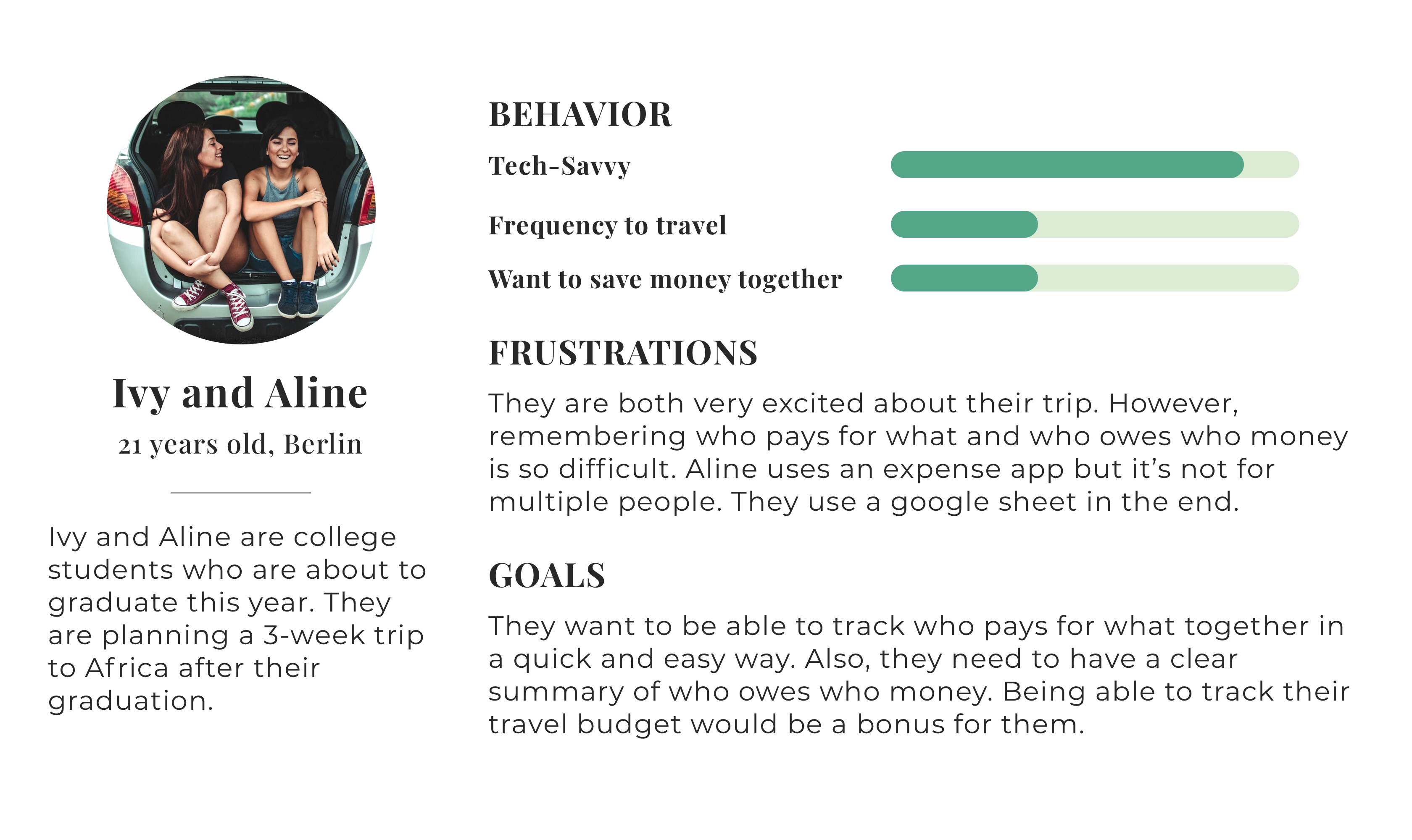
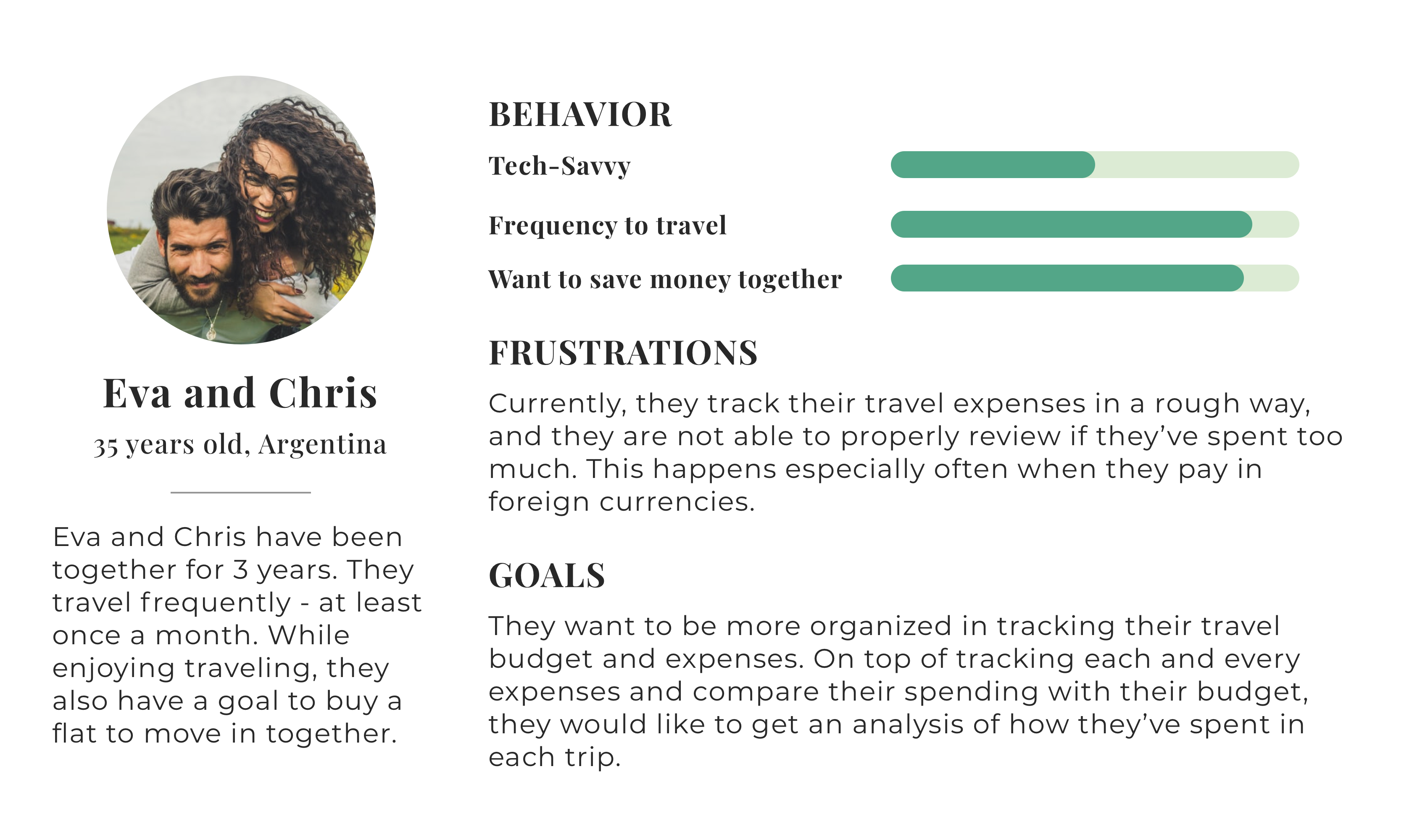
Based on my research, I created 2 user personas to represent the key audience segments of TripWallet based on my user research results. One focused more on splitting the expenses and tracking the debt balance, while the other persona’s goals were more about saving money together as a travel group.
The personas helped me focus on their needs, behavior, and goals as I moved forward with building TripWallet.
Ideate The Solution: How Would TripWallet Help Users?
Define User Goals and Tasks to Achieve them.
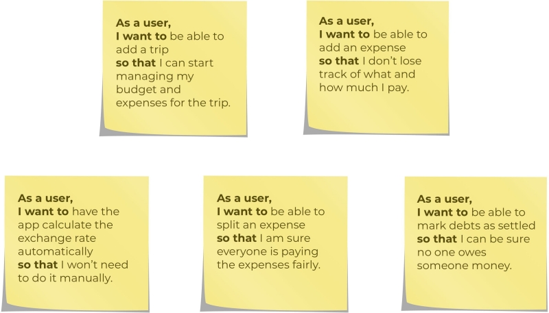
Developing user stories helped me really understand what the app needed to do to allow users to accomplish the tasks that were important to them.
Visualize TripWallet’s Navigation and Hierarchy.
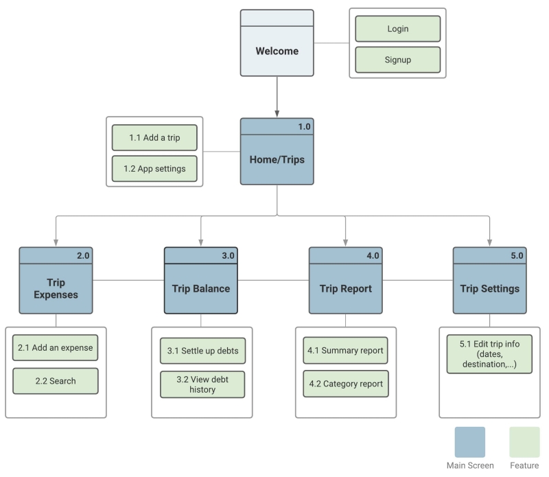
Based on the user stories, I developed a site map to outline the information architecture and visualize the hierarchy of the screens. This began to clarify the structure of the app and how users would navigate TripWallet.
Materialize The Solution: TripWallet Comes to Life.
Iterate Through Wireframes.
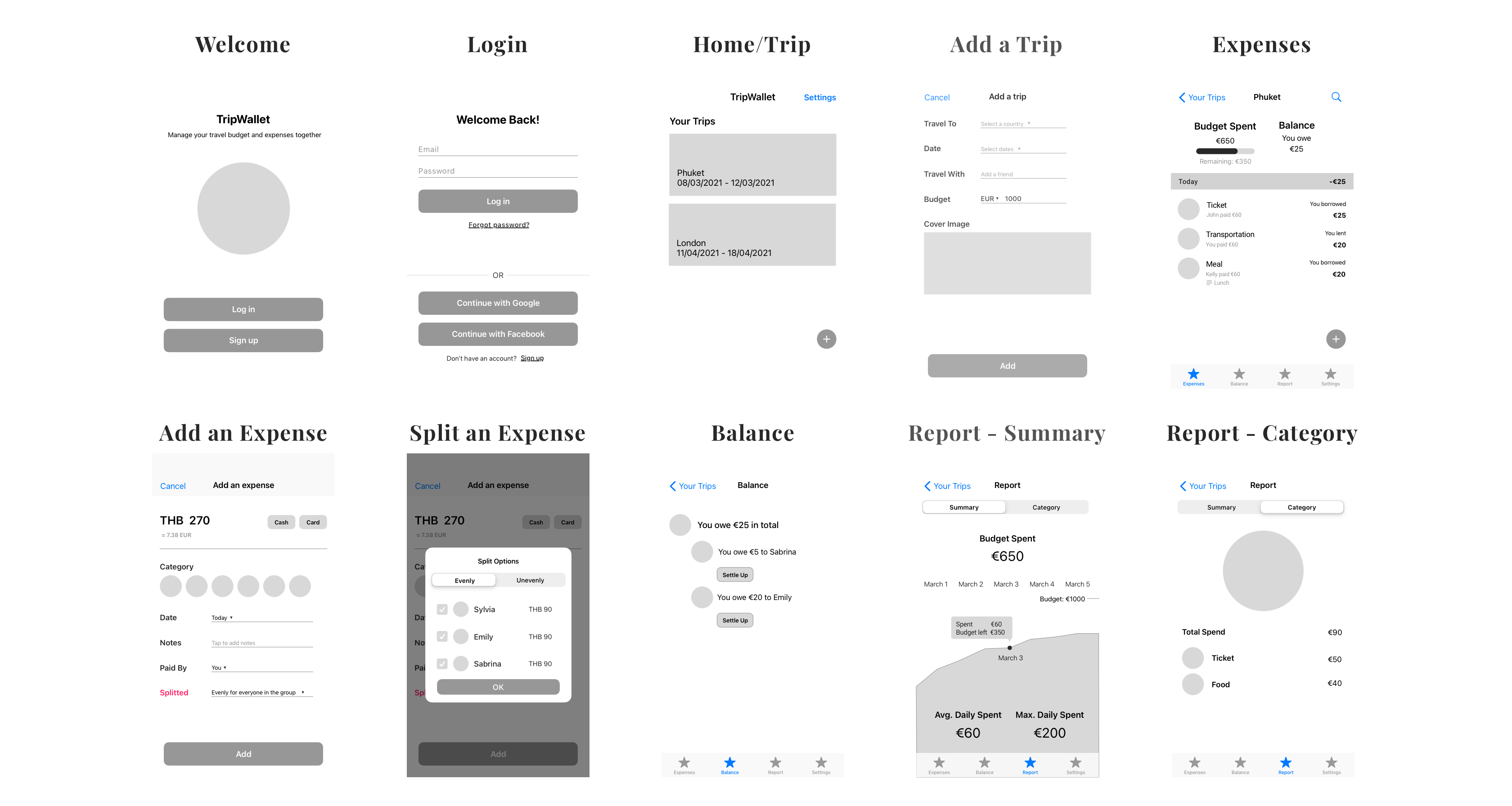
I started the low-fi wireframes with pen and paper, and then turned them into mid-fi wireframes in Sketch. As I moved further, I constantly referred to the site map, user stories, and user personas for my design decisions.
Low-Fi Wireframes

Mid-Fi Wireframes
Communicate the Visual Mission.
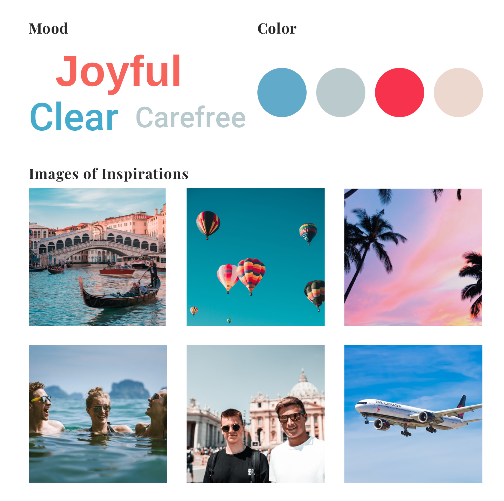
Before turning my mid-fi wireframes into hi-fi design, I established a mood board for the visual tone and emotions. Travel sparks joy, and I wanted to reflect this feeling in the user's interaction with TripWallet. I wanted this design sensibility to also help create a feeling of light simplicity for the user.
Utilize Consistent Design Standards.
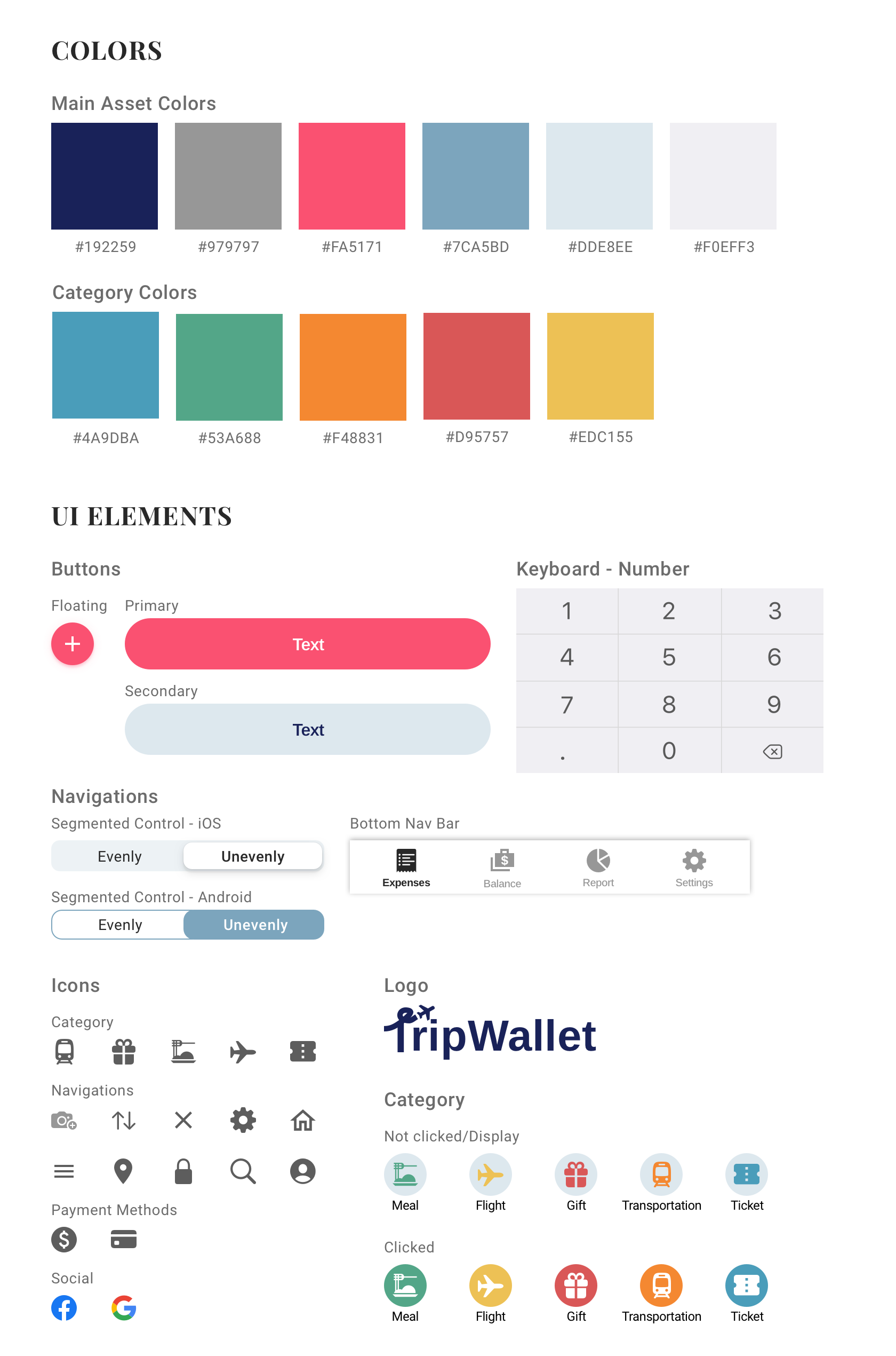
I formalized the design style guide to ensure my screens would hold a consistent look and feel. Style guides also helped the app maintain the right branding in future iterations and changes.
Get Feedback From Users.
At this point, TripWallet was ready to show to potential users as a prototype. I wanted to see if my design and UX functional choices were understood by actual users.
I recruited 6 users (3 for Android and 3 for iOS) and asked them to complete 4 tasks I defined. As they interacted with the prototype, I asked them to comment on it out loud so that I could observe if there’s anything surprising or confusing to them.
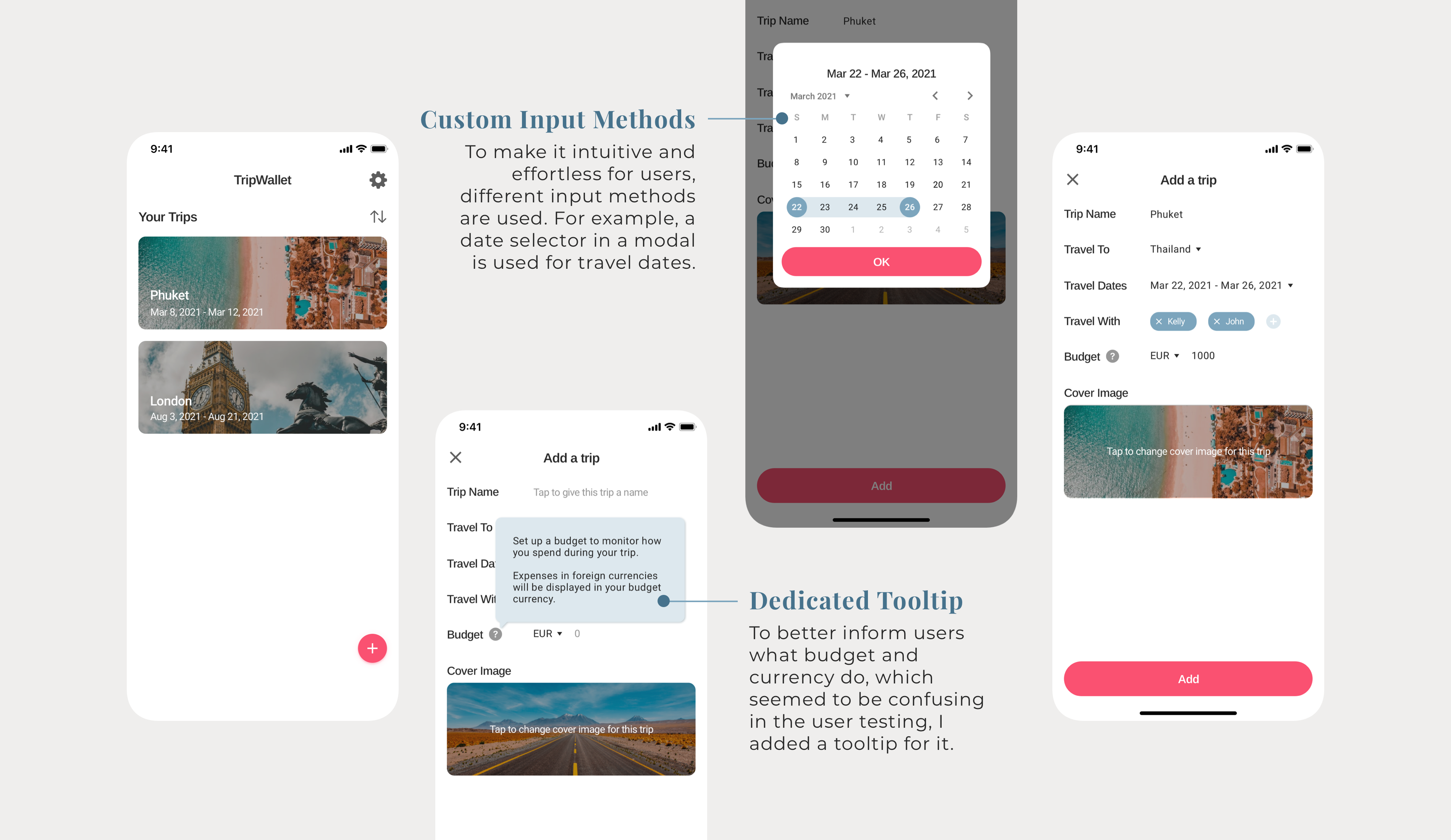
This testing helped me identify the improvement areas for TripWallet. For example, I noticed that most of the users did not get the purpose of setting a currency of the trip’s budget. I also noticed that the tapping areas were not big enough in some cases and users had difficulty tapping on them.
Final Design: High-level Features.
Adding a Trip.
Adding a trip is the first task a new user does after login/signup.
During the user testing, I noticed that since it’s the very first task for new users, the users would need extra guidance to understand how the app would work, otherwise, they’d feel unsure and frustrated. Based on this, I made some adjustments to make everything as intuitive as possible.
Adding an Expense.
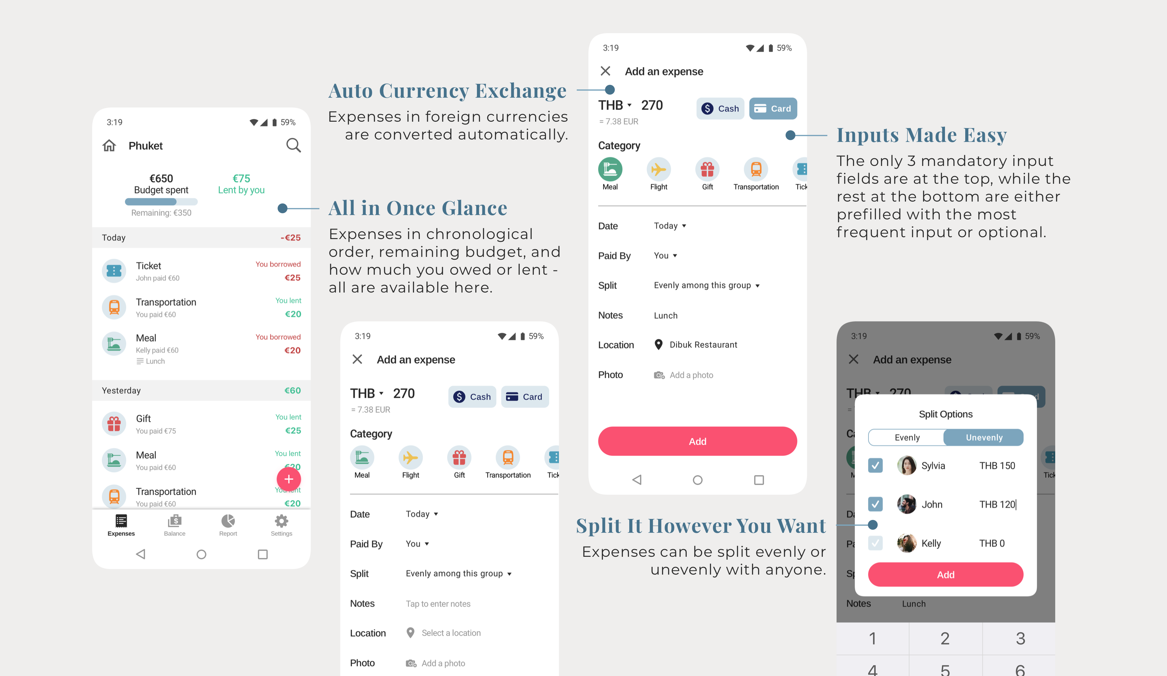
Adding an expense is the task that most users will do most frequently on TripWallet.
Based on my user research, it needs to be as effortless as possible, while providing the possibility to collect all information that users might want to put in - split options, photos, locations, and so on.
Settling Up Debts.
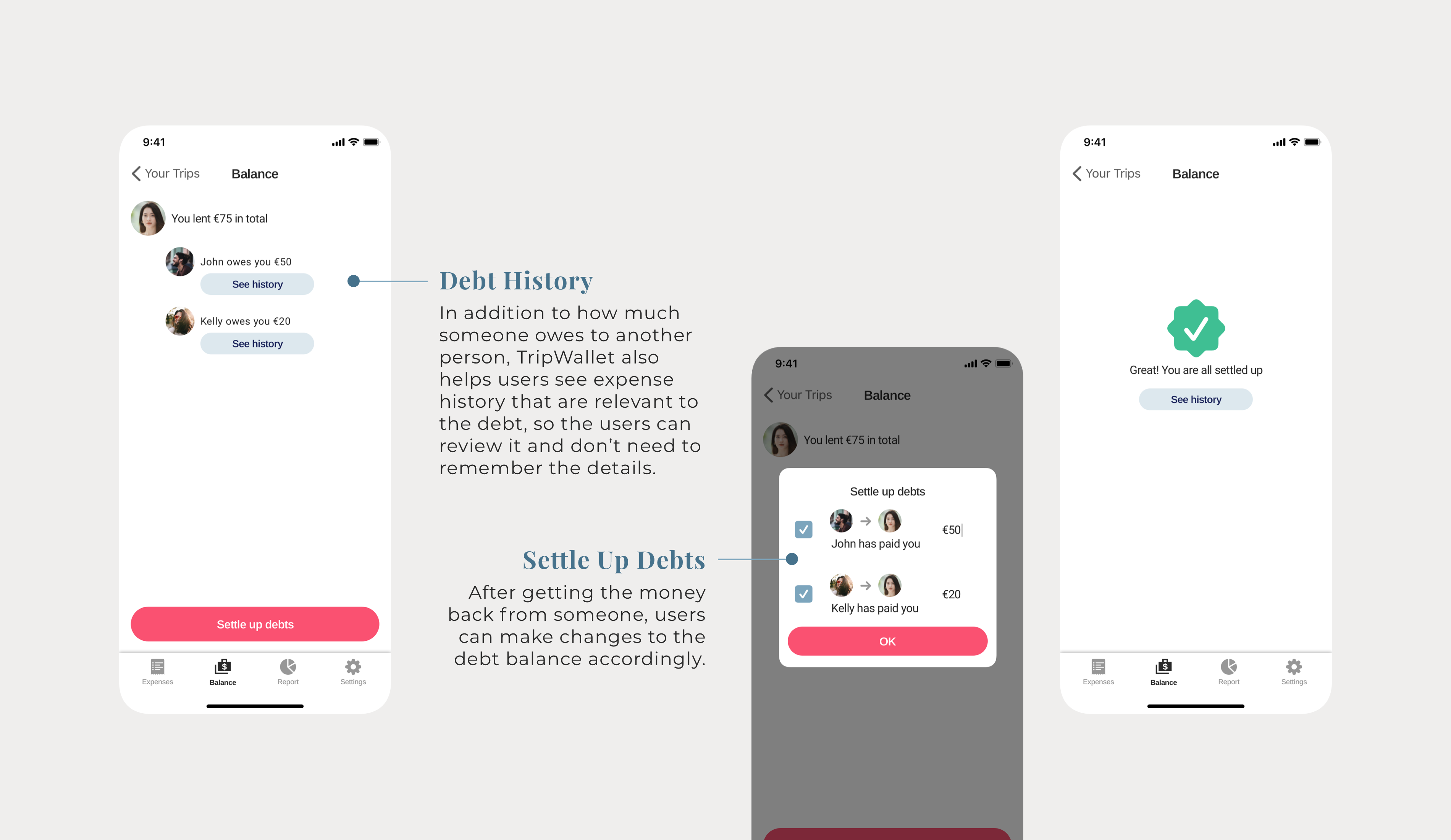
On this screen, users can check the debt balance for the trip. It clearly shows if someone owes money, and how much is owed. Users can also make changes to the debt balance by putting in how much has been repaid in the “Settle up debts” modal.
Checking Reports.
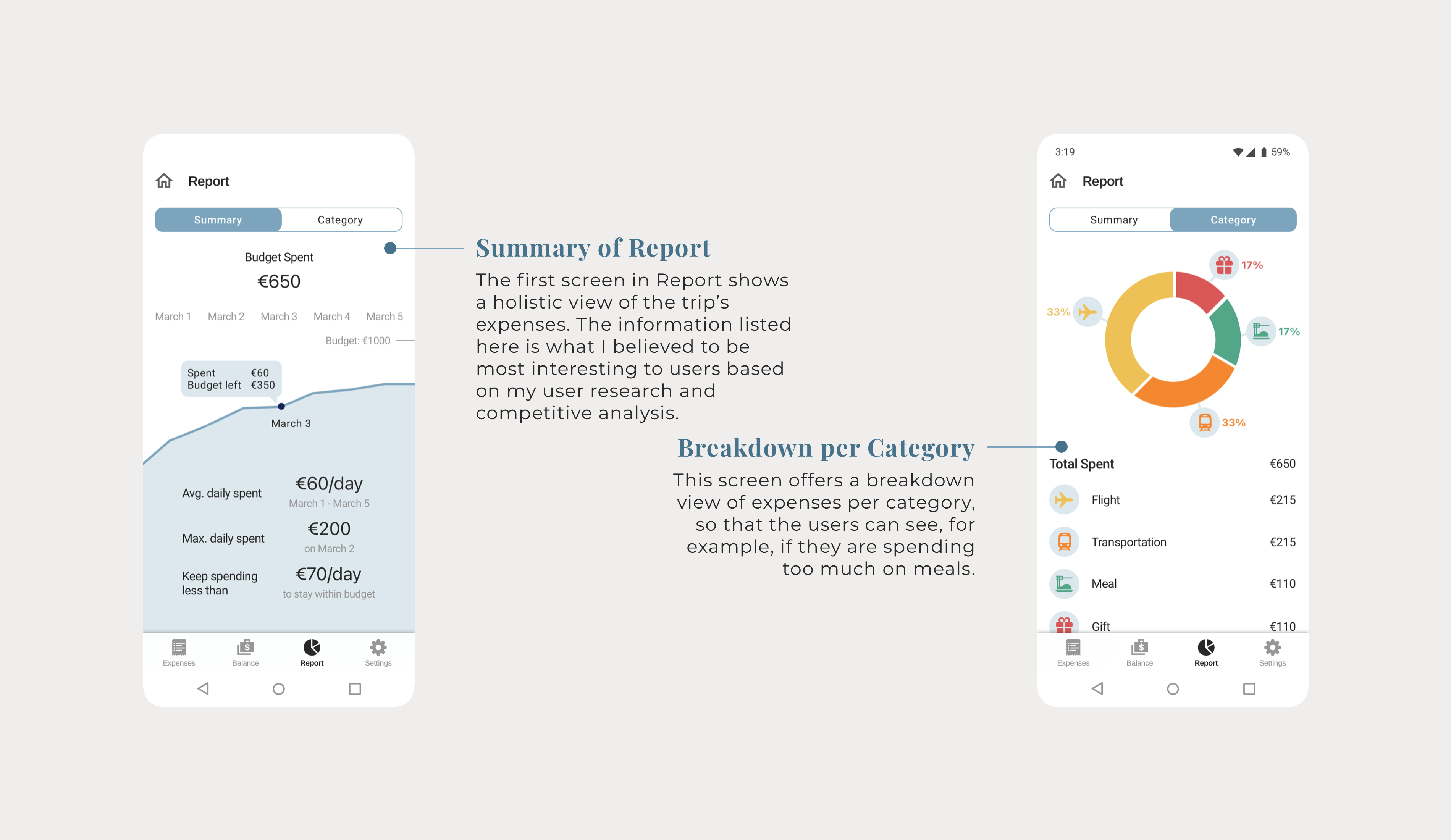
Reports show a visual and easy-to-read analysis of the trip’s expenses and budget. They help users particularly when their main motivation is saving money during their trips.
Learnings and Next Steps.
At the very end of this case study, I want to point out 2 key learnings from TripWallet:
Make It a Habit to Refer to the Findings From User Research When Making Design Decisions.
When I worked on wireframes and the high-fi design, there were countless design decisions I needed to make on each screen. Some were straightforward, some took me quite some time and experimentation to come to a final design decision.
Whenever I felt unsure of something, for example, if the total amount of expenses was more important than the amount owed/lent, I would refer to my user research and analyze the user needs carefully which helped inform the “best” design solution. I could then validate this choice in user testing.
Pay Attention to the Differences Between IOS and Android Design Guidelines So Your Design Is Natural and Intuitive For Your Users.
Since it’s the first time I designed a native app for iOS and Android, I spent a lot of time reading through the design guidelines for both platforms. Shifting my attention between both design guidelines and visualize the differences were quite difficult - for every element I had to refer to the design guidelines, as I was concerned that I would make “mistakes.”
I consulted with my mentor who gave me the advice to categorize the difference of design guidelines into either functional ones or aesthetic ones. If the difference is based on a functional reason and it could confuse the user, I should stick to the design principle for the platform. On the other hand, if it’s a purely aesthetic reason, I can be more flexible in making the decision. Also, from the brand’s perspective, the design should be aligned across all platforms to convey a consistent brand.
Another aspect to look at it is the handoff to the developers. If a design follows the design guidelines strictly, the developers can reuse the platform’s design kits more easily and shorten the development time. Thinking of it, the inputs from the developers will also affect the decision-making for the design.
Next Steps.
As a primarily learning project, TripWallet was an invaluable experience for my transition into UI/UX field. I found myself blending the Design Thinking process with my existing product management experience. If I were to think ahead, TripWallet is a project that could evolve and become a mature product that helps a lot of users. To move forward with it, I’d do the following:
- Develop the app settings flow
- Develop the flow to add more social features to the app
- Create a comprehensive business plan
- Define the scope of TripWallet’s MVP that could bring value to users quickly
- Find a dev team to start the development
Thanks for Reading!
I hope you enjoyed it. It was a long journey - I spent a lot of time and long nights working on this project, and I loved it! If you are interested in knowing more about my design or its design process, I'd love to chat.